Understanding Tailwind CSS
In this blog, we will try to understand comprehensively what is Tailwind CSS, what advantages it has to offer, along some hands-on code. 👨💻
Table of contents
Introduction
Writing CSS can many times turn into a nightmare. Period. I get it. It gets very frustrating at times to nail down on those designs that you got from your design team. I'm sure a lot of developers, if not all, have gone through the same pain at least a few times in their development careers. Well not anymore. Coz it's time to learn an interesting piece of tech that takes a lot of burden from us. And no it's not Bootstrap. It's called Tailwind CSS. Well, I agree its been around for quite a while now, but I believe Tailwind CSS is still yet to reach out to a lot of developers out there who have not used it because:
- They haven't heard of it yet (which might be a very small number) or
- They don't really know whether learning a new piece of tech related to CSS will ease out their life or not. (well of course coz you know there have been a lot of things out there, vanilla CSS3, LESS, SCSS, Bootstrap, styled-components, Windi CSS and whatnot ... pheew... quite a list isn't it )

I really hope this short guide will help you understand Tailwind CSS to a point that you say "This is it. This is the one".
Well enough of chit chat. Let's dive straight in.
Atomic CSS approach
Before jumping into Tailwind CSS, let's understand what Atomic CSS is. According to CSS Tricks "Atomic CSS is the approach to CSS architecture that favours small, single-purpose classes with names based on visual function." It's kinda like making classes that are supposed to achieve a single purpose. For e.g. let's make a bg-blue class with the following CSS
.bg-blue {
  background-color: rgb(81, 191, 255);
}
Now if we add this class to a <h1> tag then it will get a background of blue with the colour being rgb(81, 191, 255) as mentioned in the CSS.
<!DOCTYPE html>
<html lang="en">
  <head>
    <meta charset="UTF-8" />
    <meta http-equiv="X-UA-Compatible" content="IE=edge" />
    <meta name="viewport" content="width=device-width, initial-scale=1.0" />
    <title>Document</title>
    <link rel="stylesheet" href="style.css" />
  </head>
  <body>
    <div><h1 class="bg-blue">Hello world!</h1></div>
  </body>
</html>
So the above HTML will result in something like this

Now imagine writing such useful single-purpose CSS rules and keeping them all in a global CSS file. I know it's a one-time investment but think of this, you can now use these single-purpose helper classes from anywhere you want. You just need your HTML file to consume that global CSS file and that's it. You can now also use combinations of these helper classes in a single HTML tag. Let's see another example shall we:
Let's create a CSS file with the following rules,
.bg-blue {
  background-color: rgb(81, 191, 255);
}
.bg-green {
  background-color: rgb(81, 255, 90);
}
.text-underline {
  text-decoration: underline;
}
.text-center {
  text-align: center;
}
.font-weight-400 {
  font-weight: 400;
}
and then consume it in our HTML file as follows
<!DOCTYPE html>
<html lang="en">
  <head>
    <meta charset="UTF-8" />
    <meta http-equiv="X-UA-Compatible" content="IE=edge" />
    <meta name="viewport" content="width=device-width, initial-scale=1.0" />
    <title>Document</title>
    <link rel="stylesheet" href="style.css" />
  </head>
  <body>
    <div><h1 class="bg-blue">Hello world 1</h1></div>
    <div><h1 class="text-underline">Hello world 2</h1></div>
    <div class="text-center">
      <h1 class="bg-green font-weight-400 text-underline">Hello world 3</h1>
    </div>
  </body>
</html>
Well now this will generate the following result:

🗒️ Points to note here:
- Combining multiple helper classes: Look how I have combined multiple helper classes in line 14 in the
<h1>tag viz.bg-green,font-weight-400andtext-underlineand it all took effect in my Hello world 3 text - Reusability of helper classes: In the above example look at how
text-underlinehelper class is used multiple times in lines 12 and 14.
See how we were able to add different styles without even leaving the HTML page. Well, you would say that, "Hey we did have to write those helper or utility classes in the global CSS file... what about that". Well, I get it. That definitely was the initial investment we had to make to start with. And of course, God knows how many of these single-purpose helper or utility classes we would have to make if we wanted to follow this Atomic CSS architecture. And that's where Tailwind CSS comes as our saviour. (Well more than a saviour if I may .. continue reading to know more). The concept of Atomic CSS is not new but Tailwind CSS takes it to another level.

Tailwind CSS - A utility first CSS framework
Tailwind CSS, as per their own website is a "utility-first CSS framework" which provides several of these opinionated, single-purpose utility classes that can be directly used inside our markup to design an element. Some of the utility classes that I frequently use these days are:
- flex: Used to apply flexbox to a
<div> - items-center: to apply the CSS property
align-items: center;to a<div> - rounded-full: to make an image circular and so on ...
Seriously, it's not possible for me to list down all of them coz there are so many of these utility classes. But the best part is, we do not have to write these utility classes ourselves and keep in any global CSS file. We directly get it from Tailwind. You can get a list of all the utility classes they have to offer from their documentation page. Also if you are working in VS Code, you can install an extension called Tailwind CSS IntelliSense and it will give you auto-suggestions as you keep typing the utility classes as shown in the image below.

Setting up Tailwind CSS
There are multiple ways by which we can set up Tailwind CSS in our project all of which are mentioned in their documentation. Tailwind CSS works smoothly with a plethora of frameworks like Next, React, Angular etc. and even our OG HTML.
For the below hands-on demo I am using Tailwind CSS with a Next application. To set a Next app with Tailwind CSS directly, use the following command:
With npx
npx create-next-app --example with-tailwindcss with-tailwindcss-app
or with yarn
yarn create next-app --example with-tailwindcss with-tailwindcss-app
Once the project has been set up dive into the next step to create a basic card component
Hands-on demo
Let's build a card component in a Next project
// Card.js file
// to be rendered in index.js

import React from "react";

const Card = () => {
  return (
    <div className="relative w-96 m-3 cursor-pointer border-2 shadow-lg rounded-xl items-center">
      {/* Image */}
      <div className="flex h-28 bg-blue-700 rounded-xl items-center justify-center">
        <h1 className="absolute mx-auto text-center right text-2xl text-white">
          Image goes here
        </h1>
      </div>

      {/* Description */}
      <div className="p-2 border-b-2">
        <h6>
          Lorem ipsum dolor sit amet consectetur adipisicing elit. Facilis
          beatae nulla, atque et sunt ad voluptatum quidem impedit numquam quia?
          Lorem ipsum dolor sit amet consectetur adipisicing elit. Facilis
          beatae nulla, atque et sunt ad voluptatum quidem impedit numquam quia?
        </h6>
      </div>

      {/* Tech stack used */}
      <div className="flex flex-wrap items-center m-2">
        <span className=" border border-blue-300 rounded-2xl px-2 my-1 mx-1">
          #React
        </span>
        <span className=" border border-blue-300 rounded-2xl px-2 my-1 mx-1">
          #Redux
        </span>
        <span className=" border border-blue-300 rounded-2xl px-2 my-1 mx-1">
          #Javascript
        </span>
      </div>

      {/* Links */}
      <div className="flex flex-wrap items-center rounded-b-xl border-t-2 bg-white">
        <button className="border rounded-2xl bg-blue-600 text-white shadow-sm p-1 px-2 m-2">
          Go to Project
        </button>
        <button className="border-2 border-blue-600 rounded-2xl text-blue-600 shadow-sm p-1 px-2 m-2">
          Github
        </button>
      </div>
    </div>
  );
};

export default Card;
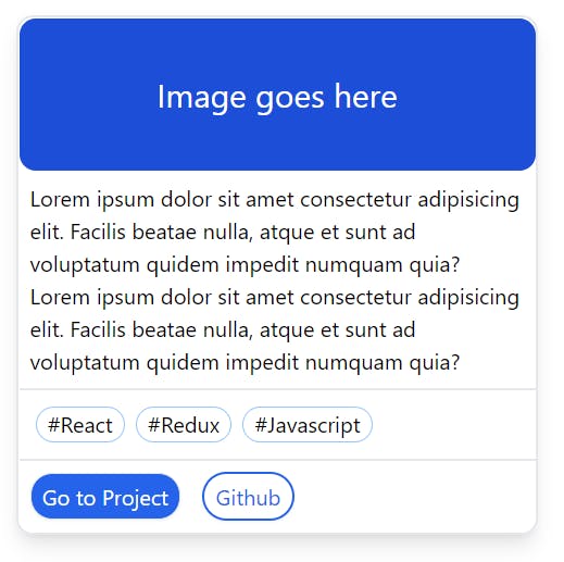
This results in the following card to be rendered in the UI:

Look how easily I am able to style the card component without even leaving the Card.js file. No need to write any extra CSS files. Using flex to a <div> applies display: flex; CSS rule to it. Want to add position: relative; to a <div>? Just add relative in the className and you are done. We can also add different modifiers like hover, active, focus etc. to conditional render utility classes. It is possible to apply complex CSS rules like:
.some-class-name {
          --tw-space-x-reverse: 0;
          margin-right: calc(0.5rem * var(--tw-space-x-reverse));
          margin-left: calc(0.5rem * calc(1 - var(--tw-space-x-reverse)));
}
by just mentioning space-x-2 in the <div> tag. Neat isn't it. And do we have to mention these styles explicitly anywhere in some sort of a global CSS file... absolutely not!. Tailwind automagically does it for us. That's the beauty of Tailwind.
We are not done yet... there's a lot of other advantages
Just-In-Time (JIT) mode -- providing lightning-fast build times
Prior to Tailwind v3, it used to purge through all the styles to remove any unused styles, so that the production build remains as small as possible. According to Tailwind, the production build used to be between 5 - 10 kB. But that's the story in production. In a development environment, CSS might get really big especially if we use a lot of personalized configuration.
With v3 and above, Tailwind released a new feature called Just-in-Time compiler. JIT compiler avoids compiling all the CSS upfront and compiles only the CSS as and when we need it. This results in lightning-fast build times in all the environments. And as the styles are generated as and when we need them, there is no need to purge unused styles and thus CSS is all the environments will be the same. This helps us get rid of the fear of any important CSS getting purged in production.
Watch Adam Wathan the creator of Tailwind CSS explaining JIT in Tailwind Labs official youtube channel:
Opinionated and flexible at the same time
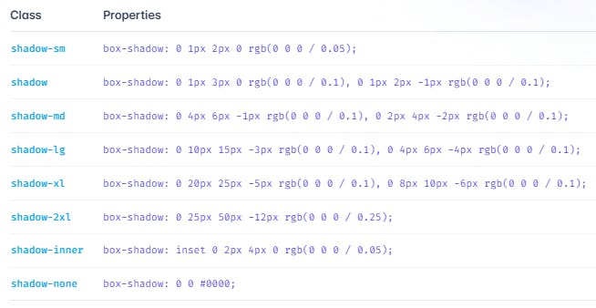
Tailwind CSS is opinionated. It does specify some constraints when it comes to styling and if you ask me it is good as it helps us keep the design part to those who actually understand it. Just look at one of their utility classes to add box-shadow to your <div>.
 (src: tailwindcss.com/docs/box-shadow)
As you can see, there are only 8 variants of shadow that Tailwind provides, with a preset value for vertical and horizontal offset, blur, spread, colour and opacity. That is why Tailwind is opinionated. It tries to give an opinion about what property values to choose from on almost all the styling properties out there. And believe me, for most of the cases, these 8 variants (for box-shadow) will be more than sufficient to come up with a great UI. For e.g. in the above hands-on example, I have used shadow-lg in the main parent <div> to get that nice outer box-shadow. Using the same variant of a particular utility class at different areas in the UI also ensures uniformity across the whole application and thus a better UX.
But in case you need some really customised value for any particular style, you can do so by adding a customized theme in the tailwind.config.js. For e.g. to get a shadow-3xl (Tailwind do not provide shadow-3xl out of the box) you can add the following lines in the module.exports in tailwind.config.js.
module.exports = {
  theme: {
    extend: {
      boxShadow: {
        '3xl': '0 35px 60px -15px rgba(0, 0, 0, 0.3)',
      }
    }
  }
}
And now with the advent of JIT, you can also use an arbitrary value inside a square bracket [] like the following:
<div class="shadow-[0_35px_60px_-15px_rgba(0,0,0,0.3)]">
  // Rest of your code goes here
</div>
Using arbitrary values may be useful when you need a specific style at only a few places for which creating a theme for it in the tailwind.config.js might seem to be unnecessary.
My thoughts
I really hope that I was able to make you understand what Tailwind CSS is and what can be achieved with it. It is a CSS framework that provides us with single-purpose utility classes which are opinionated for the most part, and which help us design our web pages from right inside our markup or .js/.jsx/.ts/.tsx files. In my opinion, it's simple and easy to understand. It's true that it might take some time to get hang of all the utility class names. Do refer to their documentation whenever you get stuck. And to all the beginners out there who are just starting their journey with web development, it is very important to know what CSS3 is before you even explore Tailwind or for that matter any other CSS framework like Bootstrap, Windi CSS etc.
Thanks for reading! If you like this blog and feel it's useful, do consider hitting the like button and sharing it with your friends, I'd really appreciate that. Stay tuned for more amazing content! 🖖
